Brand Resources
Welcome to the Polarize Poker brand resources page.
Here you have access to our brand resources available for download, as well as guidelines for their use.
Logotype
The logotype is made up of the symbol and the brand name, and the symbol can be used to identify the brand.
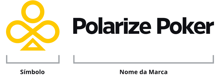
Logo variations
Main logo. Note the horizontal composition.
Logo in vertical composition.

Variation of the logo combined with the name "Coaching & Staking" in a horizontal composition.
Variation of the logo combined with the designation "Coaching & Staking" in a vertical composition.
Logo spacing
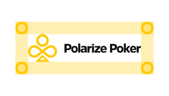
Our logo should always have enough space when applied with other elements.
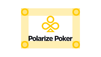
Our logo should always have enough space when applied with other elements.
Applications on colored backgrounds
The color combination of the logo with the background must be careful to ensure that the elements are legible.
Main logo applied to light backgrounds.
Main logo applied to dark backgrounds.
Monochrome logo applied to light backgrounds.
Monochrome logo applied to dark backgrounds.
On yellow backgrounds always apply the monochrome logo in black to ensure legibility.
Always pay attention to the legibility of the logo, in colors tending more towards the dark apply the logo in white.
Color
Color is a very strong way of distinguishing our brand, so the brand is recognized everywhere not only by the logo but also by the color we use.
Main color

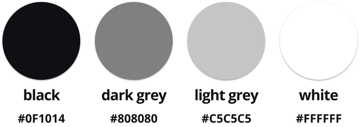
Neutral Color
Typography
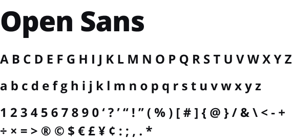
The main and recommended font is Open Sans.
